CHALLENGE
A global cotton exporter needed to redefine their look with a strong brand identity by drawing on the traditional and contemporary traits of the business.
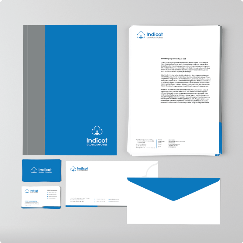
INSIGHT
Since the exporters prided themselves on the export of fine quality cotton, it had to be represented in a premium manner in its brand icon – the logo. We took inspiration from the many renditions of cotton flower, from abstract art to Indian textile design.
IMPACT
We arrived at a simple yet elegant version of a cotton flower, which immediately connects cotton to its root in India. The icon itself was isolated from the logotype to provide clarity in interpretation and give it an air of authority in business documents. Blue was retained as the prominent colour for the brand identity as it signified the corporate standing and resilience of the exporters.