Anything Delivered
CHALLENGE
Although as the first delivery company in the city it had considerable traction, the brand eventually gained various other competitors in the market from which it had to clearly differentiate itself. The brand needed to be revitalized from scratch.
INSIGHT
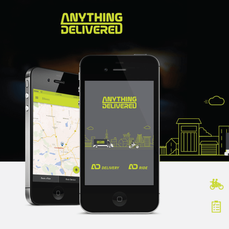
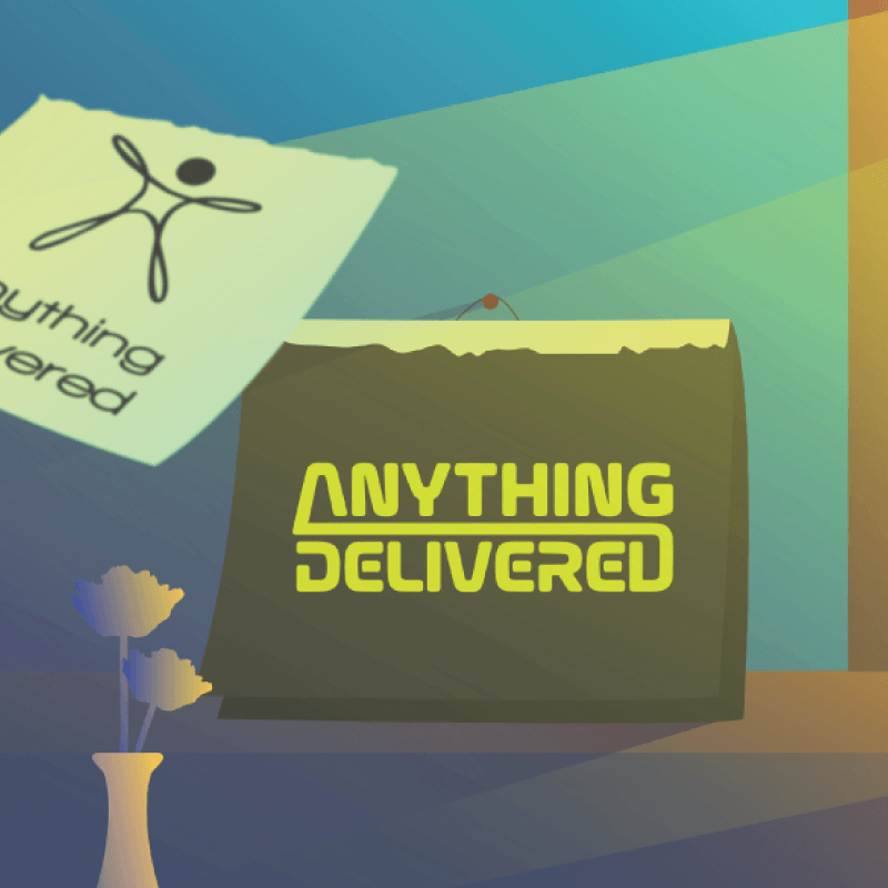
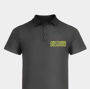
Anything Delivered needed a systemic brand revitalisation throughout all the brand touchpoints. We focused on a neon sign effect for the brand that would make it stand out visually wherever it was seen, from the lapel of a shirt to a print or outdoor advertisement, thus creating instant brand recognition and awareness.
IMPACT
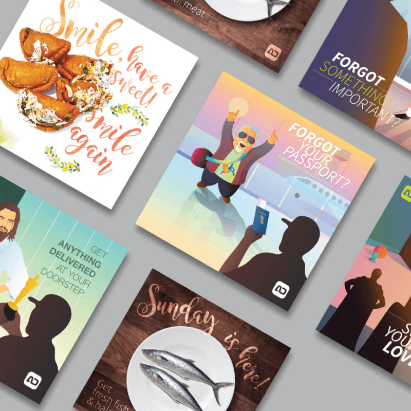
We created a modern and powerful neon sign inspired logo with a dark colour scheme to make the specially created type pop. We complemented the logo with highly detailed comic style illustrations that clearly showed the target audience the different ways that AD could benefit them, so that they wouldn’t have to sweat the small stuff. The new brand look became quite popular and got noticed in the city as a result.
Category: Branding
Tags:
Date published: June 14, 2017